Nebu Sol
Jewelry & Candle Brand
Design & Jewelry Design
A brand built from the ground up. This project encompassed end-to-end brand identity, including logo, packaging, and custom jewelry design for a magical jewelry and candle brand.

About
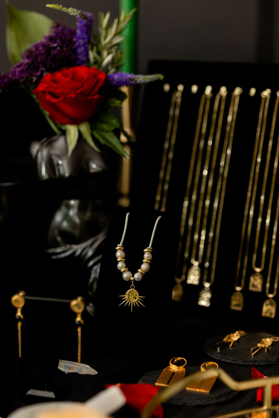
Nebu Sol is a celestial-inspired jewelry and candle brand built around the concept of the “golden sun,” with its name derived from the Egyptian word for gold and the Latin word for sun. Rooted in astrology, tarot, and mystical symbolism, the brand blends ancient meaning with modern craft. Each candle is thoughtfully formulated with a unique scent corresponding to a zodiac sign, while the jewelry is digitally designed, 3D-printed into molds, and cast in brass with gold plating, resulting in symbolic, intentional pieces that feel both magical and refined.


Synopsis
Nebu Sol was developed entirely from the ground up, beginning with concept exploration and brand strategy. We led the naming process from early brainstorming through final selection, ultimately landing on Nebu Sol, a name rooted in ancient symbolism and celestial meaning. From there, we designed the full visual identity, including the logo system and zodiac-inspired candle packaging, establishing a cohesive aesthetic that feels mystical, intentional, and elevated.
In addition to brand and packaging design, we created the digital jewelry designs that moved directly into production, guiding them through the 3D printing and casting process. We also art directed the brand’s initial photoshoot, shaping the visual tone, styling the set, and defining the overall composition, to ensure the final imagery fully embodied the magical, celestial world of Nebu Sol across all touchpoints.
Deliverables
Format
Social Images
and GIF/video loops
Style
Dark, cinematic horror
Timing
Still images + 10 sec videos
Specks
Various Social Proportions
Outline
The design process began with a deep dive into astrology, symbolism, and sensory storytelling to build a cohesive system across all twelve zodiac candles. Each candle was treated as its own mini-brand within the collection, with custom zodiac packaging, a unified box system, and tarot-style explainer cards that detailed the scent profile and the astrological reasoning behind each fragrance choice. The visual language blended celestial motifs, lunar phases, and mystical iconography, ensuring every element, from candle labels to matches packaging, felt intentional, immersive, and collectible.
In parallel, the jewelry designs were developed using a celestial and art-deco–inspired approach, combining clean geometry with cosmic symbolism. Each piece was uniquely designed to reflect themes of the moon, stars, and astrological energy, while maintaining a cohesive visual thread across the collection. Digital designs were refined with production in mind, allowing the pieces to transition seamlessly into 3D printing and casting, resulting in jewelry that feels both otherworldly and precisely crafted.
Target Audience
-
Astrology & Tarot Enthusiasts
-
Spiritually Curious Creatives
-
Luxury Candle & Home Ritual Shoppers
-
Statement Jewelry Collectors
-
Modern Feminine & Esoteric Lifestyle Consumers
-
Gift Buyers Seeking Meaning
-
Boutique & Concept Shop Shoppers
Design Theme
-
Celestial Mysticism
-
Astrology & Zodiac Energy
-
Tarot-Inspired Narrative
-
Solar Alchemy
-
Lunar Cycles
-
Sacred Geometry
-
Art Deco Elegance
-
Modern Ritual
-
Ancient Meets Contemporary
-
Ethereal Minimalism
Design Deliverables & Services
-
Primary Logo & Mark System
-
Outer Box Packaging System
-
Candle Vessel Labels (12 Designs)
-
Matches Packaging
-
Jewelry Design Renders
-
Photoshoot Art Direction
-
Brand Mood Boards
Color Palette

Software used
-
Illustrator
-
Photoshop
-
InDesign
-
Figma
Rollout Strategy
week 1
Teaser Phase
-
Close-crop horror imagery (scythe tips, foggy moon, zombie hands)
-
5–8 second soft-launch videos hinting “Something deadly is coming…”
week 2
Main drop
-
Release the hero images + videos
-
UGC challenge launch
-
Paid social targeted at horror fans, metal/alt communities, Halloween-adjacent interests
week 3
Amplification
-
Meme versions of hero shots
-
Behind-the-scenes zombie makeup time-lapses
-
Boost top-performing posts
UGC
Challenge
#HydrateOrHaunt
Fans share spooky-themed photos of themselves drinking Liquid Death.
Reward: reposts + merch giveaways (t-shirts, fake scythes, zombie makeup kits).
Polls & Interactive Stories
-
“What should Death do now that you're staying hydrated?”
-
“Zombie walk or moon ritual—what’s your vibe?”
Mood Board
These are initial visual style ideas that were pulled to generate the mood and direction for the brand.

Brand Design


.jpg)

Brand Photo shoot